Showing posts with label Charts. Show all posts

Friday, January 27, 2012

Correlation

History has shown us that when investors get scared they think in a "risk on" / "risk off" mentality - regardless of the asset class.  These knee-jerk reactions cause an unprecedented amount of correlation in the market.  The following chart does a nice job of showing how fear contributes to the overall correlation of stocks in the S&P 500 dating back to 1986.

More recently, you can see peaks in correlation around the Great Recession, fear of a double dip recession, uncertainty surrounding the Eurozone's debt calamity, and the possibility of global contagion.


Source:
www.ritholtz.com

Monday, January 16, 2012

Who actually owns the most US debt?

It has become a common occurrence to hear that the Chinese are the biggest holders of US debt... but that is simply not true. In fact, there are many different pieces of the pie, and China accounts for 9.5%. While this is nearly 1 out of every 10 dollars of US debt, it does not constitute a majority by any means.

American individuals, institutions, and Social Security are by far the biggest owners of US debt, accounting for approximately 60% of our Government's debt.

This chart from Political Calculations is a great depiction of the scenario:


              Political Calculations

Wednesday, January 11, 2012

Mo' Money Mo' ... Dividends?

According to data recently released by S&P, companies are on track to pay a record $252 billion in dividends in 2012 based on tracking dividend rates of 394 companies. Stocks of companies that paid dividends did very well in 2011 and the theme should continue into 2012. Below is a dividend trend chart and a breakdown of the top dividend payers by sector...


Source:
NYT

Friday, January 6, 2012

Real return vs. Nominal return


Referring to the graphs below, you can see that over the long term, the S&P 500 has returned an average NOMINAL return of about 10%. Adjusting for inflation, the bottom chart shows the average REAL return for the S&P 500 at about 7%. After ending the year precisely where it started in 2011, perhaps the S&P can revert to the mean in 2012.

Real return = Nominal return - Inflation


Source:
www.ritholtz.com

Wednesday, January 4, 2012

2011 Forecast Report Card


2011 was a wild ride for stocks, but in the end we closed not far from where we began the year. As the chart below illustrates, many market strategists were too optimistic. This just goes to show that even the wizards of Wall Street don't have a crystal ball.

Source: 
Birinyi Associates
www.ritholtz.com


Friday, December 23, 2011

Dividend Paying Stocks

Lately, you can't browse investment news without hearing about dividend paying stocks. What is behind this feverish sentiment and why is it important now?

To begin, a dividend is a sum of money paid by a company on regular intervals to its shareholders. A stock's dividend is calculated by totaling the annual sum of payouts made by the company and dividing that by the current stock price. This ratio is your dividend yield. 

Companies that pay consistent dividends are usually less volatile than their cash-hoarding contemporaries. Throughout the course of the year, these value oriented businesses are run in such a way that they plan to return portions of their profits back to shareholders. Conversely, growth oriented companies take all of their profits and reinvest them directly back into the business for future expansion. Cases can be made for each side in deciding the winner of the value vs. growth stock preference, but the truth is that dividend payers typically outperform during bear markets and growth stocks typically outperform during bull markets (as seen in the graphs below). 

Why now? Investors who still want to own stocks for the growth, but don't want as much volatility should be comfortable with dividend payers. However, this begs the question: are we still in a bear market, or are we entering a new bull market? The answer to that question should play a role in your current allocation.


Sources:
www.ritholtz.com

Thursday, December 22, 2011

Signs of Life

Even though it may not feel like we are making any economic progress, we are slowly clawing our way back to normal. Weekly jobless claims beat analyst estimates yet again dropping to 364,000 - the lowest reading since April 2008. Moreover, the four-week moving average is now at 380,250 claims per week. The last time we had jobless claims numbers like this was June 2008. While the overall unemployment picture still remains stubbornly high at 8.6%, we have continued to improve, slowly but surely.


Sources:
SeekingAlpha.com
Federal Reserve Bank of St. Louis

Wednesday, December 21, 2011

The Emotional Investor


With volatility through the roof recently, emotions have been running high in the investment community. This sentiment can be dangerous for returns! Remember this: emotions have no place in investing or speculating. Only research and facts should drive our decisions. The following charts from do a great job of showing what the emotional speculator goes through as he loses money.


Source:
www.ritholtz.com

Thursday, December 15, 2011

TED Spread

The TED Spread is a common reference for determining the amount of stress banks are having raising short-term cash. Specifically, it is the difference between three-month Eurodollar contracts (represented by LIBOR) and three-month Treasury Bill yields.

Historically, it has been a good indicator of perceived credit risk in the overall economy because T-Bills are generally thought to be risk-free offerings and LIBOR measures the credit risk of lending to commercial banks. The difference is a premium for taking on additional risk.

Currently, the TED Spread sits at a new 52 week high of 56.82. Banks aren't lending to each other for a reason: they don't like the odds of repayment.

This can have serious consequences for a global economy trying to emerge from stagnation, and an even bigger impact for those countries trying to avoid a recession.


TED Spread Chart via Bloomberg:
Dec. 14, 2011
%20%28Bloomberg%29

Sources:
Bloomberg.com
Bankrate.com

Wednesday, December 14, 2011

US Oil Exports on the Rise

The changing of the tides in US oil exports and imports has caught some attention lately, and I thought it would be timely to share this graph from Bloomberg.

The US transitioned from net imports to net exports in 2010 and has been able to sustained that trend. Increased domestic production and greater vehicle efficiency have supported this move and should continue to do so for years to come. Currently, net exports expanded to a record 920,000 barrels per day in September (the latest data from the Department of Energy).

Moreover, Citigroup, Inc. recently released a statement noting that "U.S. net exports of oil products such as diesel will more than double in the next decade from record levels as slowing domestic consumption cuts the nation’s dependence on foreign energy."


Oil trade

Source:
Bloomberg

US Housing Prices: A Reflection of Japan?

This chart is an unsettling illustration of the similarities between the home pricing in the USA and that of Japan shifted by 15  years. Japan's real estate peaked in 1992 and was hurting for decades after. Hopefully, similar economic stagnation is not the case for the US in years to come...


Sources:
http://www.ritholtz.com
Richard C. Koo
Nomura Research Institute, Tokyo
Real-World Economics Review, Issue # 58

Wednesday, December 7, 2011

European Fear Factor

Debt problems in Europe have overwhelmed the news recently. Specifically, the rest of the world is very concerned that Portugal, Ireland, Italy, Greece and Spain will not be able to pay back their current debts. As a result, no one will lend them new money unless they are handsomely rewarded for taking on increased risk. That being the case, new bond auctions from these countries have had to offer bonds with very high yields in order to entice lenders. This graph from Bloomberg is a nice illustration of that point:


With Greece being at the forefront of this mess, this graph from Reuters demonstrates which countries stand to lose the most if Greece defaults on their obligations. One thing is clear, a Greek default would resonate throughout Europe and the rest of the world.


Sources: 
Bloomberg
Reuters

Thursday, December 1, 2011

Rail Traffic Shows That Economy Is Growing

The Association of American Railroads released their weekly data today. While their comments weren't indicative of flourishing growth, investors can still take this as evidence of economic expansion.
"AAR today reported gains in weekly rail traffic, with U.S. railroads originating 265,304 carloads for the week ending Nov. 26, 2011, up 4 percent compared with the same week last year. Intermodal volume for the week totaled 190,866 trailers and containers, up 3.7 percent compared with the same week last year.
Ten of the 20 carload commodity groups posted increases compared with the same week in 2010, including: motor vehicles and equipment, up 42 percent; crushed stone, sand and gravel, up 30.3 percent, and petroleum products, up 28.4 percent. The groups showing a significant decrease in weekly traffic included: farm products excluding grain, down 18.1 percent, and waste and nonferrous scrap, down 10.8 percent.
Weekly carload volume on Eastern railroads was up 1.8 percent compared with the same week last year. In the West, weekly carload volume was up 5.3 percent compared with the same week in 2010. 
For the first 47 weeks of 2011, U.S. railroads reported cumulative volume of 13,710,056 carloads, up 1.8 percent from the same point last year, and 10,775,044 trailers and containers, up 5.1 percent from last year."

Sources: 
Pragmatic Capitalism
AAR

Tuesday, November 29, 2011

Structural Unemployment

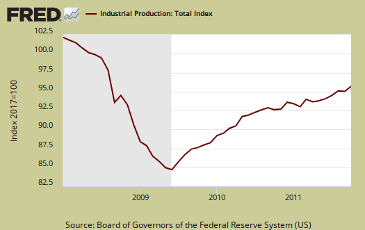
14 million Americans are unemployed and yet one sector can't hire new employees fast enough. Looking at the charts below, it is plain to see that manufacturing job vacancies in the United States aren't being filled to meet demand. In fact, the October 2011 unemployment rate for manufacturing was 7.7% compared to the overall unemployment rate of 9.0% (per the Department of Labor).

Consider this, on average it takes companies about 7 weeks to fill a vacant job. Recently, hiring a new manufacturing employee has taken approximately 12 - 15 weeks.

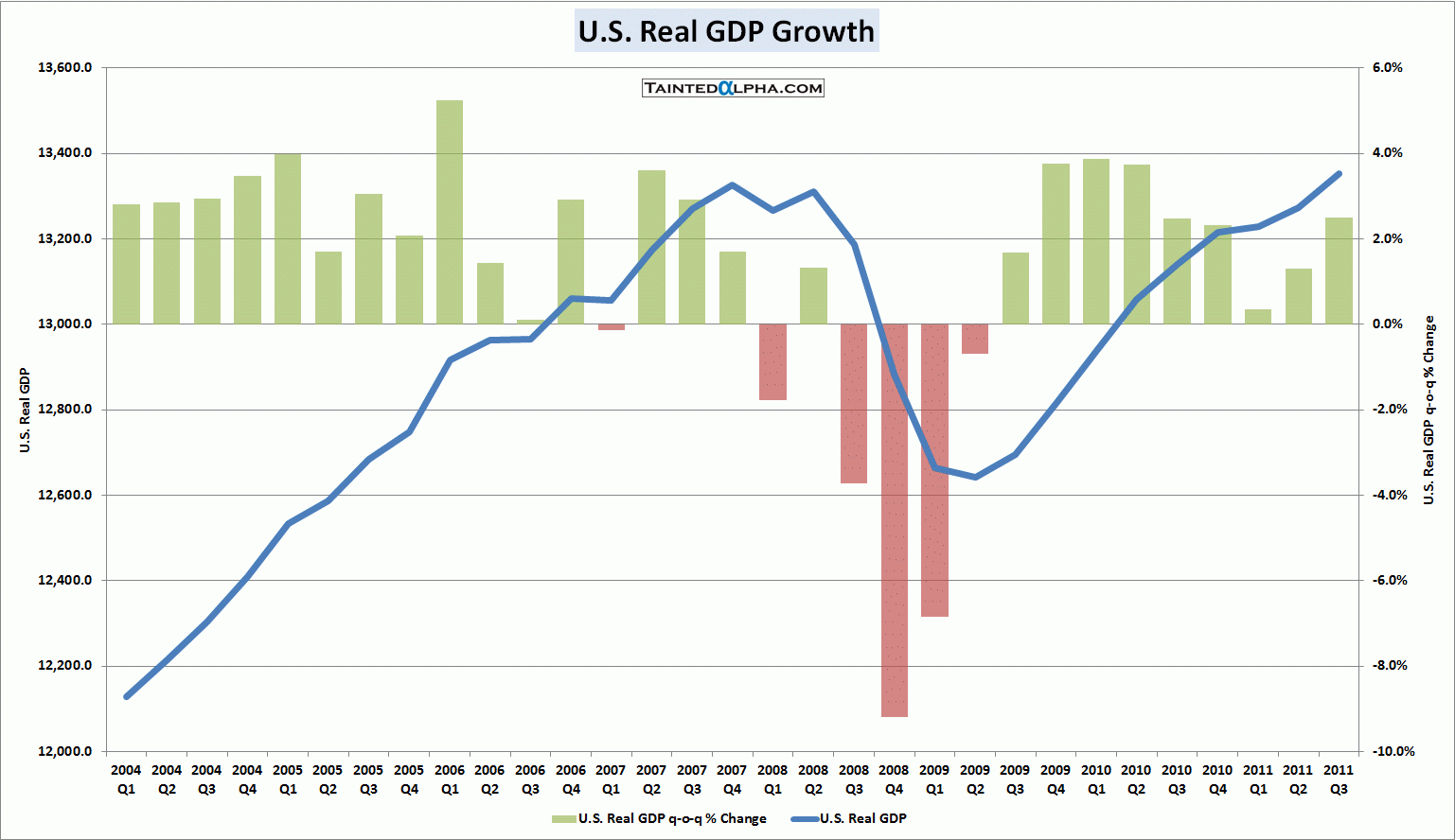
This data supports the notion that there is structural unemployment in our economy, where American skills and American jobs are mismatched. High unemployment rates aside, think of the lost production / GDP / consumption our economy is missing out on.

Fixing structural unemployment will take time. Troops returning home will have solid military training, which may translate well into the manufacturing workplace, but that alone is not the solution. Americans will either have to outsource a segment of this supply chain or place a larger emphasis on trade skills in our educational system.

One thing is certain: manufacturing is fueling much of our economy's current growth. We need to support the strength of this sector.


This graph illustrates how job openings in the manufacturing sector have outpaced total nonfarm job openings from the depths of the recession.


Sources:
stlouisfed.org
cleveland.com

Wednesday, November 23, 2011

October Industrial Production Beats Estimates

Industrial production expanded by 0.7% in October, beating analyst estimates of 0.4%. However, the reading for September, initially reported at .2%, was revised down to -.1%. That being said, actual two month industrial production is right in line with analyst estimates. The graph below demonstrates how this sector continues to be a source of support for our recuperating economy.


 Specifically, this production data measures the total output of manufacturing, mining, electric and gas industries in the United States. At current levels, industrial production is still 5.3% below pre-recession levels.

The Federal Reserve published a nice breakdown of the industry groups that contribute to industrial production:
"Manufacturing output increased 0.5 percent in October and was 4.1 percent above its year-earlier level. In October, the factory operating rate moved up to 75.4 percent, a rate 11.0 percentage points above its trough in June 2009 but still 3.6 percentage points below its long-run average.
The output of durable goods increased 0.8 percent in October and has gained 7.8 percent in the past 12 months. Advances of at least 2 percent were reported in October for electrical equipment, appliances, and components; motor vehicles and parts; and aerospace and miscellaneous transportation equipment. In contrast, losses of 2 percent or more occurred for wood products and nonmetallic mineral products.


The index for nondurable manufacturing rose 0.2 percent in October. Among the major components of nondurables, the output of apparel and leather jumped 2.8 percent, and gains were also registered for food, beverage, and tobacco products; chemicals; and plastics and rubber products. Decreases were recorded for textile and product mills, paper, printing, and petroleum and coal products. The index for other manufacturing (non-NAICS), which consists of publishing and logging, declined 0.2 percent.


The output of mines climbed 2.3 percent in October, with gains in each of its major components, after having dipped 0.5 percent in September. Capacity utilization in mining moved up to 92.7 percent in October, a rate 5.3 percentage points above its long-run average. The output of utilities edged down 0.1 percent, and its operating rate declined to 77.5 percent, a rate 9.1 percentage points below its long-run average.


Capacity utilization rates in October at industries by stage of process were as follows: At the crude stage, utilization increased 1.5 percentage points to 89.9 percent, a rate 3.5 percentage points above its long-run average; at the primary and semifinished stages, utilization edged down 0.1 percentage point to 74.0 percent, a rate 7.3 percentage points below its long-run average; and at the finished stage, utilization rose 0.7 percentage point to 77.2 percent, a rate 0.1 percentage point below its long-run average."

Source: Federalreserve.gov

Tuesday, November 22, 2011

Trouble in the Euro-zone

This is a great illustration from Mint showing Euro-zone public debt as a percentage of GDP. You can easily see why the PIIGS are in trouble.


Q3 GDP Revision

This morning, the revised Q3 GDP (Gross Domestic Product) data was released. After revisiting the numbers, the Commerce Department lowered their initial growth estimate of 2.5 % down to an even 2%.

In economic theory, Okun's law describes the relationship between quarterly changes in GDP growth and quarterly changes in the unemployment rate. Generally speaking, reduction in the unemployment rate trails GDP growth by about 2%. Therefore, with the current economy displaying anemic growth of 2%, the unemployment rate will remain at 9% for the near term.

After digesting this information, the stock markets opened modestly lower.


Source: TaintedAlpha.com


Following a GDP growth reading of 1.3% for the second quarter, growth of 2.5% would have been a large jump.